
Presentations
Designed to be flexible, our templates are clutter-free, allowing your content to shine and your audience to remain focused on the presenter.
Our main presentation template combines structure with flexibility, ensuring your presentations are unique to your audience while maintaining consistency and best practices. You’ll find slide templates for a range of common use cases in a lightweight, easy to edit format.
We’ve also developed additional resources to extend your presentation capabilities across less common, but equally important formats. These include charts and graphs, infographics, bespoke tables for planning and timetabling, iconography and maps. Slides from this additional resources deck can be dragged over to your main presentation document within the desktop PowerPoint app.


Top tips for using our templates
- Keep it simple. The cleaner your slides are, the more power your messages have. Don't feel tempted to fill blank space. Don't add unnecessary images to over illustrate your point. Don't cram so much onto one slide that your audience misses what you're saying while they struggle to read what's on the screen – there's nothing wrong with splitting related content across a number of slides to keep people focused on the point in hand.
- Design content, not slides. We've done the work for you! Spend your time ensuring your presentations are as clear and informative as possible.
- Don't go over the top with effects. Animations can, when used properly, help to unpack complex concepts to aid your audience's understanding. Used too often, though, animations and transitions can be a distraction and in extreme cases cause nausea. Ask yourself – does this make sense without an effect? If the answer is 'yes', move on.
- Use high quality images. Poor quality images can cheapen even the smartest presentation. Avoid the use of clip art where possible in favour of royalty free stock photography, or images from the University's asset library. Never squash or stretch an image – always resize from the corner.
- Use video in Powerpoint. Our templates offer a fullscreen video slide. Embed your video to avoid having to switch between applications and risk disrupting your flow and your audience's attention.
- Spend time getting to know Powerpoint. Simple tricks in Powerpoint can make you look like a pro!
- Instead of clicking 'New Slide', click the arrow next to it to select from our preset templates.
- Addressing a number of topics? Use a Section Divider slide to help your audience understand the topical transition.
- Add notes to help you keep your flow, and to remind you of the content of subsequent slides.
- Take advantage of Microsoft’s training tools, but be careful not to use too many of the whizzy effects and transitions you may learn, as these can pull focus from your content.
Dos and Don'ts

Do follow the guidance and our top tips to maintain impact
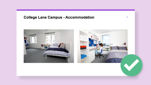
Do use high quality illustrative images from the Image Library

Do not paste in content without correcting fonts and colour themes

Do not over-crowd slides
Do not use PowerPoint's Design Ideas tool, as this overrides the template
Downloads
| Main presentation template | Download |
|---|---|
Main presentation template (for international business only) | Download |
| Extra slides template | Download |
Related Guidance
Get in touch
If you have any questions please contact a member of the team:
| Contact | |
|---|---|
| Studio team, Marketing and Communications | studio@herts.ac.uk |
| Jak Kimsey, Head of Digital and Creative Experience (he/him) | j.kimsey1@herts.ac.uk |
| Marketing and Communications Business Support | marketinguh@herts.ac.uk |