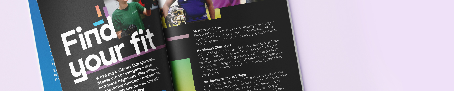
Typography
In today’s digital landscape – more than ever – people are aware of typography, it is key that we maintain consistent use of type throughout our brand.
The choice of a typeface plays a pivotal role in shaping a brand's identity and communication. It serves as a fundamental element that conveys the brand's personality, values, and message to its audience. A well-selected typeface can evoke emotions, establish credibility, and create a memorable impression on consumers.
In order to protect the integrity of our visual identity our primary typeface is only available for use by approved creative partners. In all instances, staff should use our system font.
System font: Arial
Arial is our approved system font, and we encourage all staff members to utilise it consistently in their work. The use of Arial ensures a cohesive, professional and accessible appearance across all documents, presentations, and communications produced within the University.
By adhering to this standard font, we enhance the clarity and readability of our content while reinforcing a unified brand identity. Consistency in font usage not only promotes a sense of coherence but also fosters trust that your communications are supported by the University. Arial is available in range of weights.
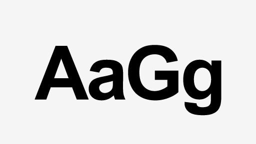
Arial Bold
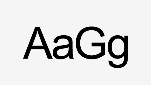
Arial Regular
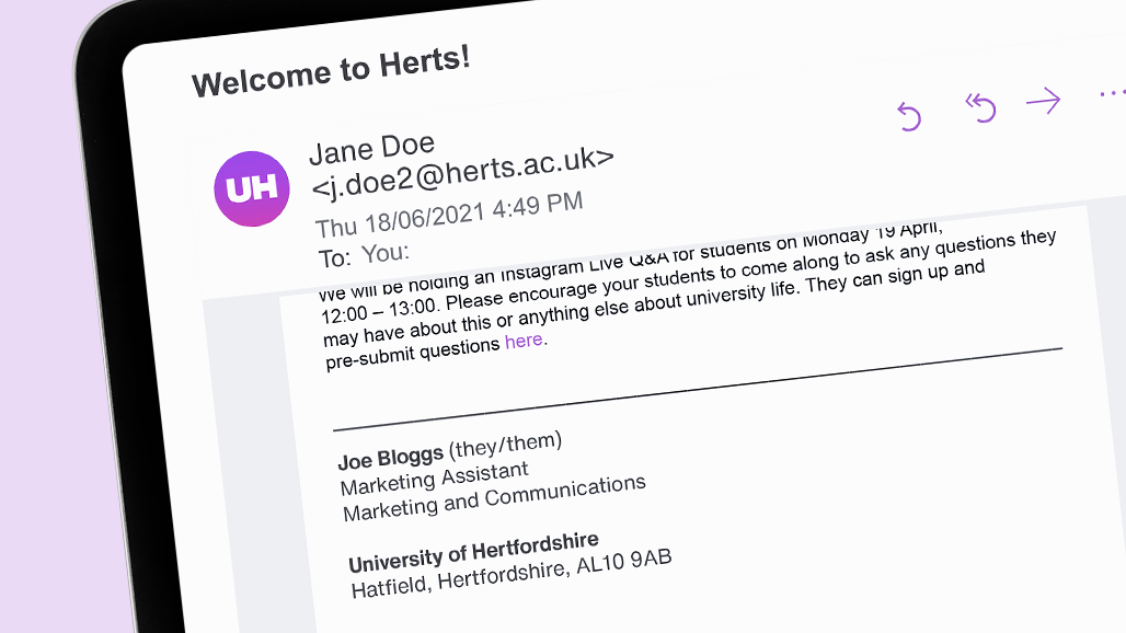
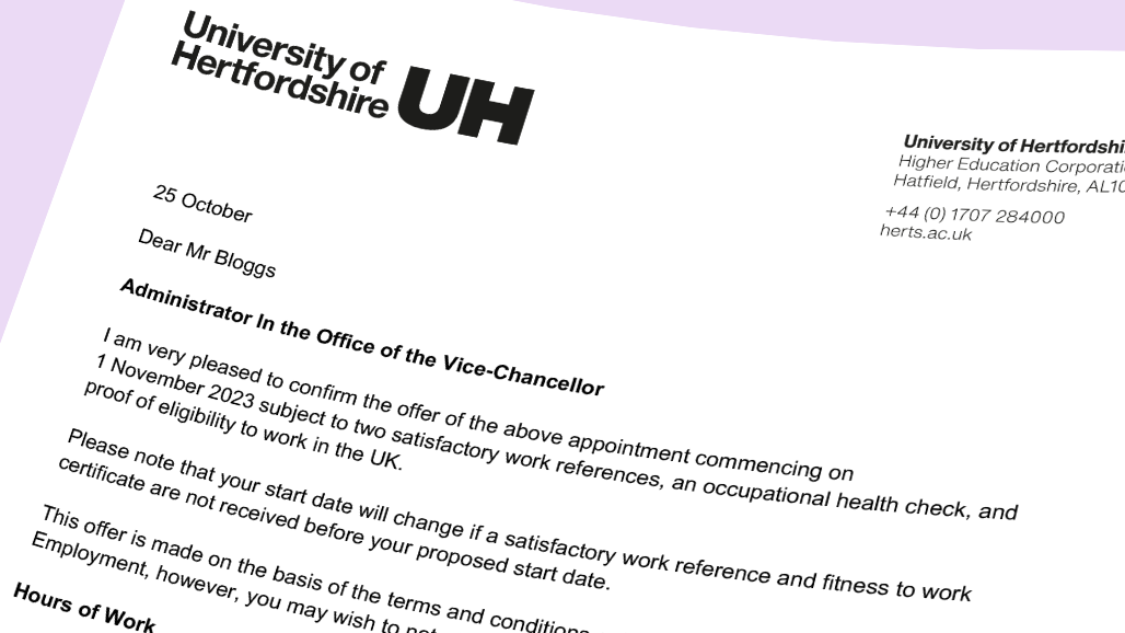
Arial in use
What to use and when
| Style | Font | Pt size | Colour |
|---|---|---|---|
| Document title | Arial bold | 20pt | Black |
| Heading 1 | Arial bold | 16pt | Black |
| Heading 2 | Arial bold | 14pt | Black |
| Heading 3 | Arial bold | 12pt | Black |
| Body | Arial regular | 11pt | Black |
Related guidance
Get in touch
If you have any questions please contact a member of the team:
| Contact | |
|---|---|
| Studio team, Marketing and Communications | studio@herts.ac.uk |
| Jak Kimsey, Head of Digital and Creative Experience (he/him) | j.kimsey1@herts.ac.uk |
| Marketing and Communications Business Support | marketinguh@herts.ac.uk |